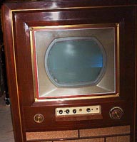
THE SETLiving with 1953 Living ColorOkay, why not 1954 living color? That's when the CT-100 was introduced.  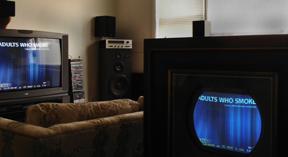 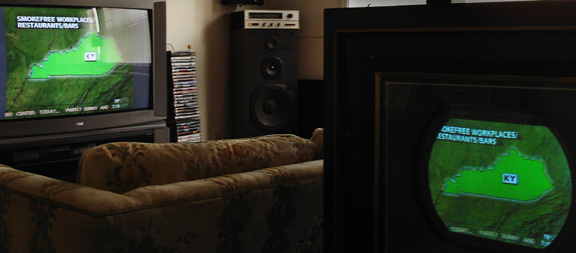 [For reference, I now view/edit web images with a Samsung SyncMaster 730B LCD monitor via the DVI (digital) interface. As a result, new images on this website may tend to appear darker on analog monitors.] Red. What happened to red? Actually, there doesn't seem to be much of it compared to blue or green. Here are a series of five 15GP22 screen shots added late on August 13 of a movie shown on ABC earlier in the evening. Much of the red is from an emblem on an indoor football field, and there's some interesting yellow too. Especially in that shot with a flying football. 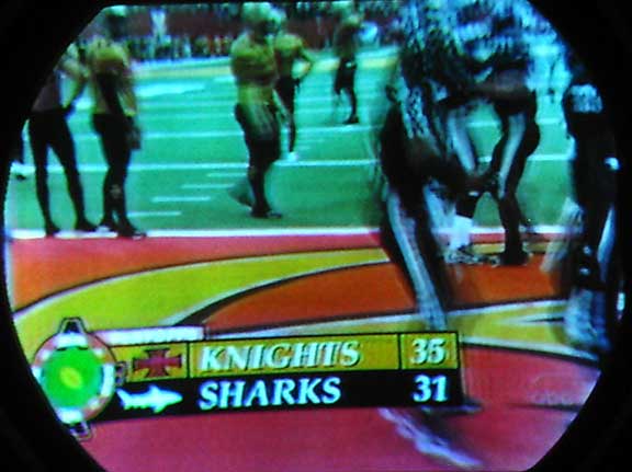 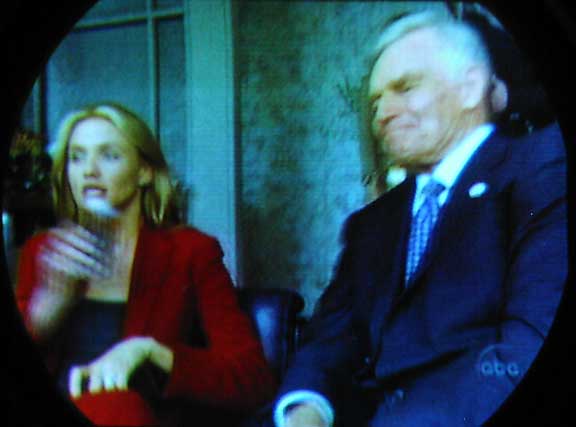 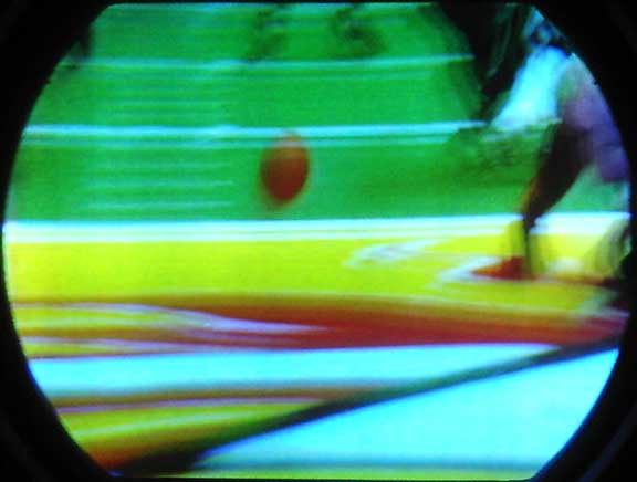 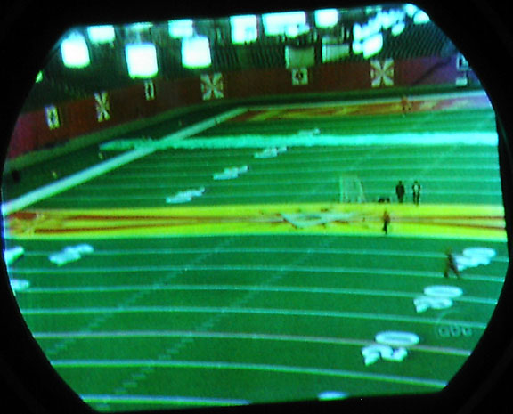 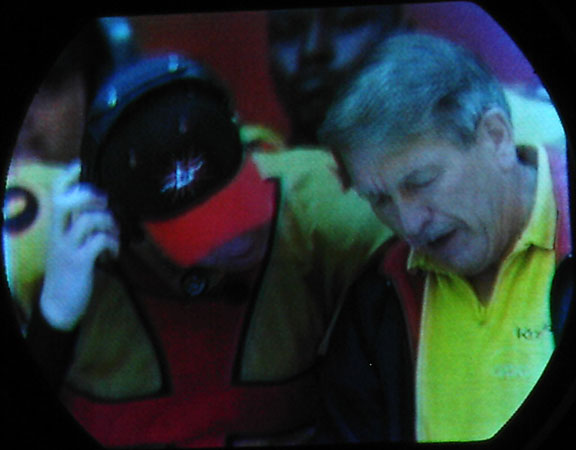 Next, I sure would like to get an actual patch of this guy’s hide and compare it with 1953-NTSC-reproduced hues. Eyeball-to-15GP22, this created the most excitement for me in terms of being different from a modern TV screen. I hope this guy’s supposed to be purple, because that’s exactly what I saw. The best word to describe it is probably royal, or maybe regal, purple. Deep and rich compared to a modern TV screen reproducing the same image. This next screen shot from Sept. 13, 2005, provices a better color representation and so replaced a less accurate, more-blue photo of Barney. 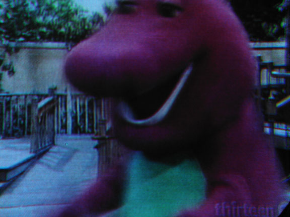 Okay, next I admit to tweaking the user convergence and focus controls on glowing old B8000194 before shooting this lower right-hand corner of the 15GP22 screen. But not by much. Check out how well the convergence circuits hold the three separate color screens one on top of the other. Those 'fingers' to the right of the temperature are the feathers of the translucent NBC peacock watermark. 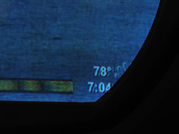 You know how those scrolling headlines across the bottom of news broadcasts sometimes contain an icon. WNBC separates subjects with a tiny but brightly colored peacock that showed up quite nicely on the Merrill after alignment, and so I swept the camera along with the banner (hence the smeared 'static' text above the peacock) to get this shot. Not great here, but the small bird leaves a colorful image on the 15GP22. Squint a bit and you may see some nice green on the right feather. 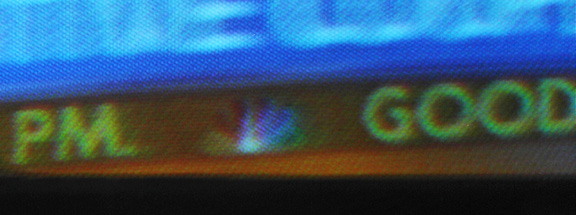 And finally for now, a few last words: after completing the convergence procedure by the book, it was okay but not good enough for a tweaker who cut bait years ago tuning touchy microwave varactor multipliers for hours on end. Turned out the key to a breakthrough yesterday was the horizontal convergence amplitude adjustment, a pot conveniently accessible from the front of the Merrill when the pencil box and mahogany insert are removed. In fact, both the horizontal and vertical convergence amplitude and shape controls were run to the front panel making the convergence task up-front convenient. It was the blue gun that was somewhat misconverged on the left, but more-so on the right side of the CRT. Some other areas of red, mainly in the upper center-left of the screen were also at issue but were ameliorated after the book alignment and final tweaking session. CTC-2/CT-100 Matrix Issues In reference to the CT-100 matrix and an NTSC color bar signal . To simulate an NTSC color bar generator, I cobbled together the following kludge. Played a DVD with a full color-bar test signal and routed it via S-video to an S-video VCR where the channel 4 RF output went to the CT-100. The DVD player also drove a projection HD set via component video from which a photo was taken as a reference. The reference set is an RCA Scenium HD52W140, whose three 7-in. CRT’s probably use ATSC-standard phosphor. Shot the reference screen with an El-Cheapo brand digital camera whose colorimetry I have heard may match the ATSC standard. So, a photo of the color bars should look good, and it does. The height of the original color bar pattern on the projection set is 2 feet, 2 inches. 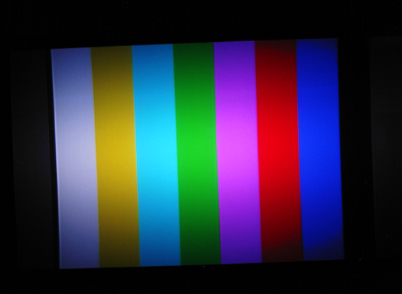 Now on to the CT-100 matrix issue: If the control grid for the red gun in a 15GP22 were not driven by up to twice the voltage as the other two guns, as vintage documentation indicates, then I suspect the yellow bar could be greenish, the magenta bar bluish, and the red bar would be correct hue-wise but dark. Here are some shots illustrating RGB drive signals generated by the CT-100 B8000194 for the 15GP22 control grids. They were shot in daylight and so are full of unwanted reflections but should adequately illustrate the true conditions. 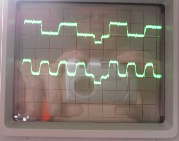 Refer to the next graphic. The red drive signal is again shown. The green drive signal (lower trace0 green control grid is shown. Here the peak drive voltage for green is about 90 volts above ground. 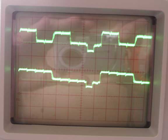 Clearly, the red drive signal does not appear to be twice the amplitude of either of the other drive signals. So what does the color bar pattern look like on the 15GP22? 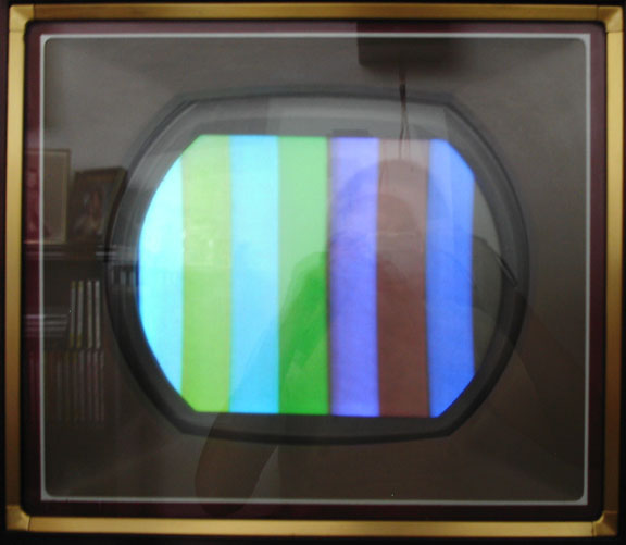 The blue filter angle: this color bar display responds normally when viewed and photographed through a blue filter. I lightened the through-the-filter shot a bit since it was understandably quite dark. 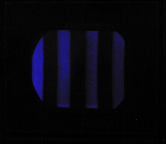 CTC-2/CT-100 Matrix Issues -- more data... Color bars appear to take on a special cast when displayed by a CT-100 on the color-gamut-correct 15GP22. As the latest 15GP22 screen photos attest, when a CT-100 is adjusted specifically for NTSC color bars, they look fine and can be fairly accurately photographed digitally and displayed on the web ...with one exception. The blue bar saturates the camera and appears pale when displayed on the web. Adjusting the contrast and brightness can compensate for the over-sensitivity of the camera to NTSC blue, but the other colors are then too dark. The second new bit of CT-100 trivia covers the amplitude of 15GP22 control grid drive levels. When I adjusted the set to favor color bars, the red drive voltage ran twice that of the green drive voltage, which is just what vintage documentation (and Old_TV_Nut among others) indicated. Incidentally, the high voltage was running 17.5 kV the day these screens were shot. It depends greatly on line voltage, but under 'load' the H-V flyback supply driving the 15GP22 runs between 17 and nearly 20 kV. 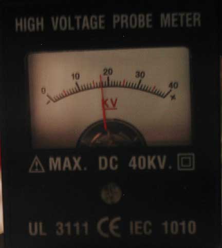 Here's a thumbnail of the CT-100 tweaked for color bars followed by two screen shots that, when combined, give a fairly decent flavor of what the color bars look like on a 15GP22.
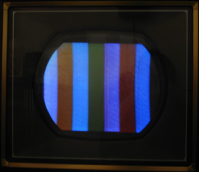 In the next two images, superfluous color bars were darkened.
Again, if you add the blue bar in the top photo to the set of bars in the lower photo, a more accurate image results, since compensation is made for the overexposed blue. 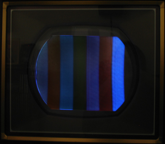 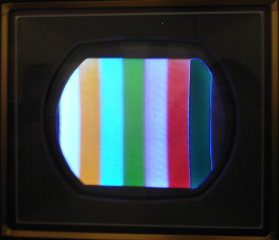 Next, here's a scope shot of the red and green signals on the control grids of the 15GP22. At a vertical sensitivity of 50V/cm, the scope indicates about 60 volts for the red (bottom) signal and about 30 volts for the green signal. 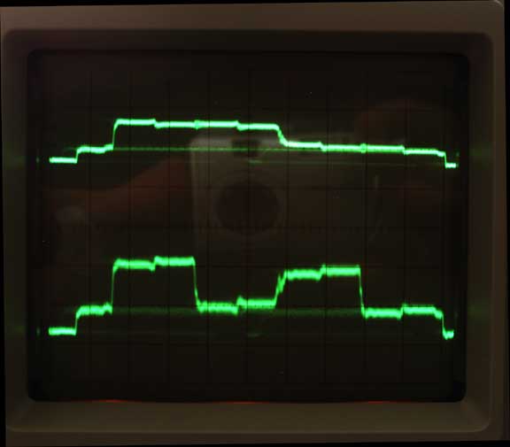 And finally, it's a screen shot of the mono stairstep pattern that results when displaying the NTSC color bars without chroma information; that is, with the 'color' control fully CCW.  Update September 5, 2005 The slightly Photoshop-brightened screen shot below is the result. Unlike the earlier two-shot example, this single image represents a current, improved matrix adjustment. I've monitored it step-by-step with a blue filter (the strip of 35-mm film). If you have and view the image through a blue filter and see alternating blue and black stripes, the long chain from what is on the 15GP22 screen to what you see on your monitor has probably not seriously compromised the image. 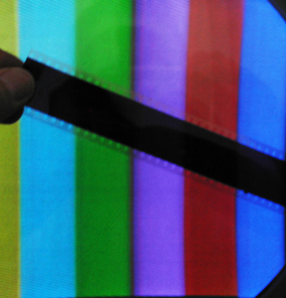 --Pete [Created 8-14-2005 Updated 8-16-2005, 9-13-2005, 10-30-2005, 7-8-2006]
|